SNACK FESTIVAL
SNACK FESTIVAL
2025
2025
2025
2025
Creative Direction
Creative Direction
Creative Direction
Creative Direction
Branding
Branding
Branding
Branding
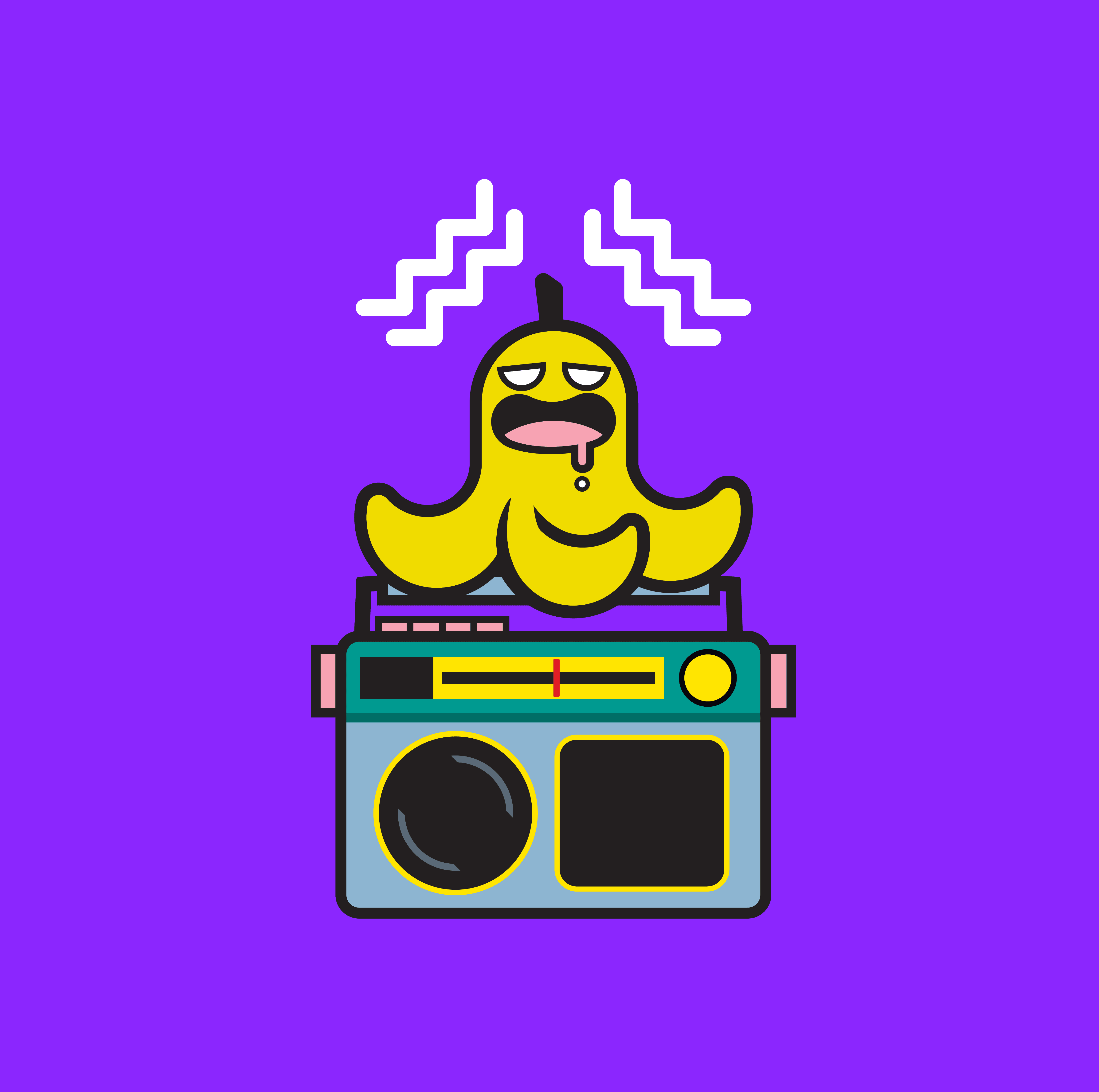
The Snack Festival rebrand focuses on refreshing the visual identity while keeping its bold, bright colours that already resonate with the audience. My design thinking centred on making the visuals feel more funky, playful, and unique to capture the energy of the festival crowd. The concept introduces stronger, more memorable branding elements, particularly an icon, the banana, representing both a “snack” and a quirky festival symbol. The design approach balances eyecatching illustration, vibrant colour palettes, and bold type, making the identity adaptable across posters, merch, and digital platforms.
The Snack Festival rebrand focuses on refreshing the visual identity while keeping its bold, bright colours that already resonate with the audience. My design thinking centred on making the visuals feel more funky, playful, and unique to capture the energy of the festival crowd. The concept introduces stronger, more memorable branding elements, particularly an icon, the banana, representing both a “snack” and a quirky festival symbol. The design approach balances eyecatching illustration, vibrant colour palettes, and bold type, making the identity adaptable across posters, merch, and digital platforms.